COVID 19 Data Visualization through Automatic Phase Detection

Pradipta Biswas, KamalPreet Singh Saluja, Somnath Arjun, LRD Murthy, Gowdham Prabhakar, Vinay Krishna Sharma, Jeevitha Shree DV
Indian Institute of Science
Abstract: This paper presents a new interactive visualization system to represent
and compare rate of spread of COVID 19 pandemic across different countries over
time. We surveyed existing visualization techniques used in various websites
and media outlets and introduced use of a knee detection algorithm that divides
the exponential spread in multiple linear components. A set of use cases
demonstrates the utility of the system in comparing the spread across different
countries for both analysis and prediction.
1.
Introduction
Data
visualization or information visualization always played a key role in
scientific analysis. Starting from John Snow’s analysis of cholera epidemic in
1854, till now a good visualization can represent inherent trend in data, which
may not otherwise be visible from raw numbers. The recent COVID 19 pandemic
poses new challenges to data scientists too for its vast and rapid spread and
significant economic impact. This paper investigates existing visualization
techniques used to represent ongoing spread of the pandemic and then proposes a
new web based interactive visualization tool. In particular, we have developed
and deployed a web based interactive software that indicates spread of COVID 19
pandemic by automatically dividing the duration of spread based on rate of
increase of cases. It uses a Knee detection algorithm to progressively divide
the duration. The shape of the graphs (like linear, parabolic or exponential)
can be compared at different stages and countries with respect to the average
number of new cases and deaths. Instead of dividing the timeline uniformly for
all countries on ad hoc basis, the website automatically detects phase of
transmission in a data centric manner for each country. Our analysis and
website can be used to
· Undertake
comparative analysis among countries
· Automatically
detect and compare phases of spread across different countries
· Prevent spread
by taking examples from other countries
In the
following paragraphs, we listed the existing visualization techniques and their
short comings and then presented our proposed approach with case studies of
representative use cases.
2.
Existing
Visualization Techniques
A plethora of work has been done on visualizing COVID-19 data
since the outbreak of the pandemic. Those visualizations can be primarily
classified into two groups - visualization with zero or less interactivity
represents the first group and complex interactive visualization techniques and
tools represents the second. Static visualization [1,2] uses basic graphs such
as bar and line graphs for representing attributes of COVID-19 dataset.
Washington Post [1] used collection of bar graphs for comparing new cases and
deaths between countries. Each chart represented a country and each bar of
every chart displays the number of cases or deaths. Financial times developed a
visualization [2] with series of line charts for comparing daily deaths. Bar
and line charts were combined together to form composite static graph [3] for
showing two different data attributes - bar chart was used to display number of
new cases with line charts showing the change of percentage of daily deaths.
The chart was annotated with events like schools closed, complete lockdown
started and so on. A few visualizations allowed user interaction [4, 5] like
hovering the mouse over bars and points in line charts. Worldometers
website was one such example which used two graphs for showing total number of
cases and new cases every day. These type of representation is quite easy
to implement and understand but it can miss relevant information. Two other
visualizations [6] used more interactivity than the previous example with line
charts to represent second derivative of daily number of cases and deaths displaying
their progression rate. Majority of websites [1, 8, 9, 10, 11] used interactive
world map charts or world map globe as their primary layout for the
visualization. Almost all these visualizations had hover and click
interactivity displaying data attributes like number of cases, number of
deaths, active cases, recovered cases, number of fatal cases and so on.
Flourish studio [13] used four types of visualization techniques for managing
distinct information with live updating graphics as follows
1. Interactive trajectory chart for number of cases and
deaths
2. Sunburst was used for breaking the impact of virus by
countries
3. Searchable line chart for number of confirmed cases
and recovered cases
4. World map charts for number of cases and deaths
Wikipedia and Tableau Public [12, 15] used interactive
stacked bar charts for showing attributes like active cases, total cases,
deaths, recoveries and number of people hospitalized. Interactive trajectory
chart was used in International SOS website [14] to compare rates of new cases
each day to determine how fast the outbreak is growing in countries. Users can
toggle between logarithmic axes (default) and linear axes. This tool consists
of two more charts, first one compares between the
number of cases against the number of tests performed, second one shows the
cumulative tests carried out per 1000 people in countries. Examples of these
graphs can be found in a separate
page.
In summary, we have identified following challenges while visualizing data
related to the spread of the COVID 19 pandemic
1.
Range of data: The number of cases and deaths range
from a tenth of million to less than hundred in different states, regions and
countries. It is difficult to plot this wide range of values sharing a single
scale. The trend may look flat even if it is not in countries or states where
the number of new cases is in hundreds when plotted with a country or region
where it is in thousands.
2.
Data transformation: Usually in science, researchers use
log or semilog transformation for plotting data with
a wide range. However, presently the COVID statistics has a huge influence on
people’s perception of threat and a flat logarithmic curve may undermine the
effect of the disease among common people if they do not follow the actual data
transformation.
3.
Proportional
statistics: A
plethora of statistics is defining new variables like number of people affected
per capita or per million population or proportion of death with respect to
total number of affected people. These statistics often exaggerate the problem
for both small and large countries. For example, a huge number of death may
seem a small proportion of per million people in a country like India or China
and only a few deaths may seem a big number for a small and less populous
country.
4.
Information overload: When the graphs present data for
multiple states or countries, all graphs turn indistinguishable at the early
stage of the pandemic and countries where the spread has not yet reached peak
clutter together even for a set of line graphs.
5.
Difficulty in trend
analysis: The WHO
and Bing website undertook a novel approach of relating the total number of
cases with radius of a semi-transparent circle and placing it at geographic
location. While this visualization can present a snapshot of present status but
do not provide an indication to trend of spread over time. The traditional
trend analysis graphs are often not interactive and show a similar trend for
many countries in a cluttered way.
3.
Proposed
Approach
We have proposed the following approach in visualizing the
spread of the pandemic for comparison and prediction among different states and
countries
1.
Automatic phase
detection: At
present, the spread of COVID-19 is shown to have an exponential trend in most
countries. An exponential curve is difficult for both comparison and prediction
as it has a vertical asymptotic trend to infinity. Our analysis automatically
divides the duration of spread of the disease based on rate of increase in new
cases using a knee detection
algorithm [16, 17] and shows a set of three graphs which are easier to
interpret and extrapolate than a single exponential graph. The shape of the
graphs (like linear, parabolic or exponential) can be compared at different
stages and countries with respect to the average number of new cases and
deaths. We used two different Y axes to indicate number of cases and deaths.
2. Combination of bar and line graphs: A line graph is good to indicate trend and takes least screen estate. However, if it is close to any axes, then the line often overlaps with the axis itself and may seem discontinuous. However, a column graph uses more screen estate and thus more visible than a line graph while depicting a parameter with small values. When we plot both number of total number of cases and number of new cases per day using same Y axis, we used a line graph for total number of cases and a column graph for number of new cases per day. Same logic is also followed for showing number of deaths.
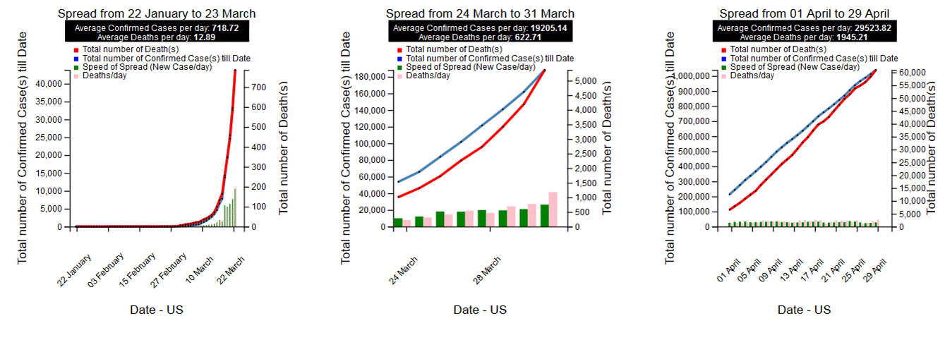
Figure 1. Set of three graphs combining line and bar charts
3. Combination of Line graph
and Pie chart: While three graphs are used for
comparing different phases of spread for a single country or state, we have
used a combination of line graph and pie chart (figure 2) to compare the spread
among multiple countries or states and their daily contributions to number of
new cases and deaths. The line chart only compares the recent past among
different countries or states. The pie chart shows the ratio of number of cases
and deaths for a particular date of different countries or states with respect
to the world or India respectively.
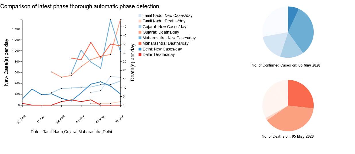
Figure 2. Comparative analysis using line graph and
pie chart
4. Comparative statistics on daily
basis: For
individual state or country, we divide the total duration in three separate
graphs. Each of these three graphs (figure 1) show total number of cases and
deaths as well as number of new cases and deaths per day. However, for
comparison among multiple regions (figure 2), we use only number of new cases
and deaths per day for following reasons
a.
Number of new cases and
deaths each day have a smaller range than total number of cases
b. Number of new cases and deaths per day depict the speed of spread and indicates the trend better than total number of cases
3. Use Cases
A
comparison of number of new cases and deaths per day for four countries having
total number of cases between 13500 and 14500 on 18th April 2020.
·
Only Austria has a decreasing trend in terms of new cases per day
·
Number of deaths are increasing at Ireland
·
According to our analysis, the spread is lagging by a couple of days in India,
5 days in Peru and a week in Ireland than Austria
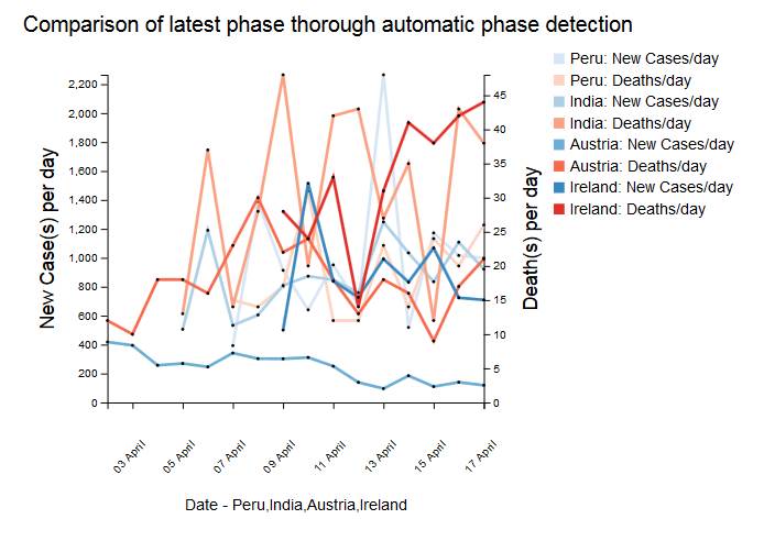
Figure 3. Comparison graph
A similar
comparison of trends in COVID 19 spread in different Indian states was
undertaken on 20th April 2020. The graphs below (figure 3) showed
·
Increasing Trend: Maharashtra, Gujarat, Rajasthan, Tamil Nadu
·
Decreasing Trend: Kerala, Karnataka, Madhya Pradesh
· Variable Trend: West Bengal, Andhra Pradesh, Telengana
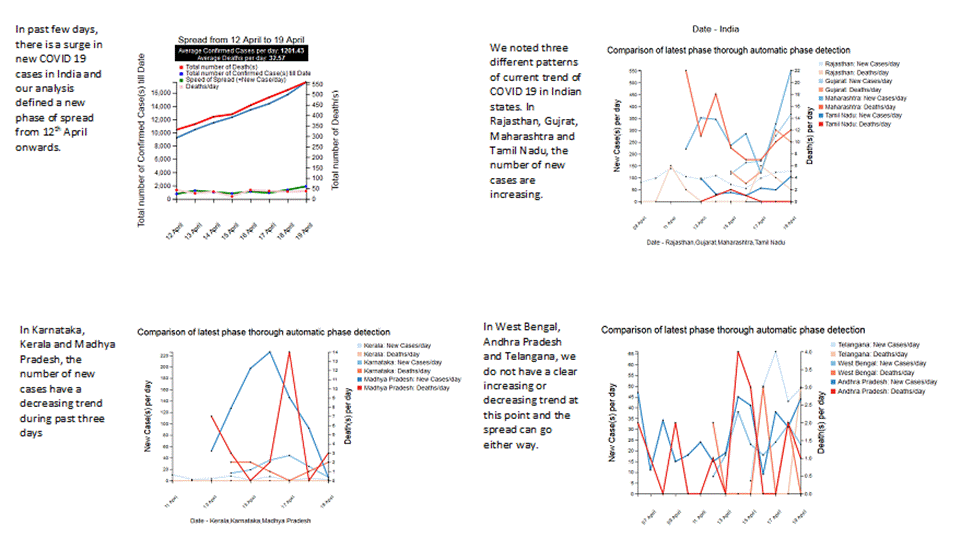
Figure 4. Trend analysis of Indian states
Analysing
similarity in trend of spread
By comparing average number of new cases per day at different
phases of trend, we can estimate the rate of spread in upcoming future.
As of 28th April 2020, the average number of new cases per day in Karnataka (14.22) was similar to the same parameter at Bolivia (15.68) from 25th March to 13th April and at Jordan (15.33) from 14th March to 4th April. However, the spread took different directions in Bolivia and Jordan, comparing the situations there in mid April may be useful for Karnataka at present time.
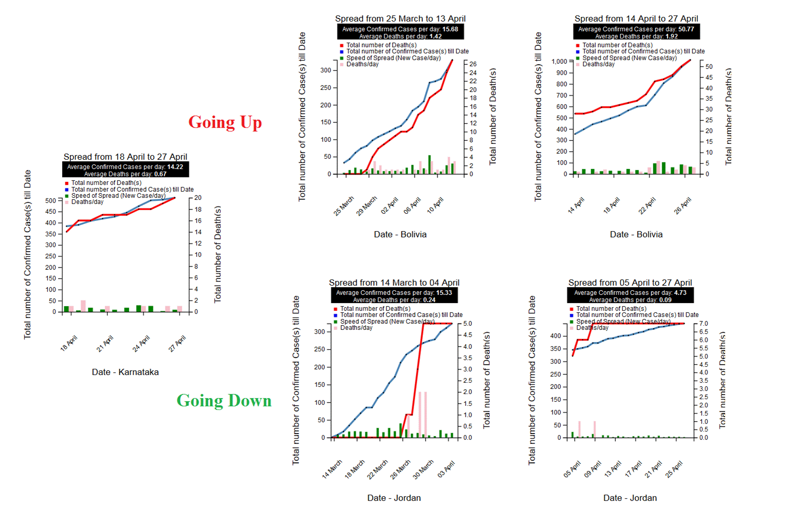
Figure 5. Similarity in trend analysis
Our website shows comparisons of recent past with present
state of COVID 19 spread in multiple countries. For example, the following
graphs show that till mid-April, number of new cases was higher in Germany than
UK although at present time the trend is reversed as the pandemic is better
contained in Germany than UK.
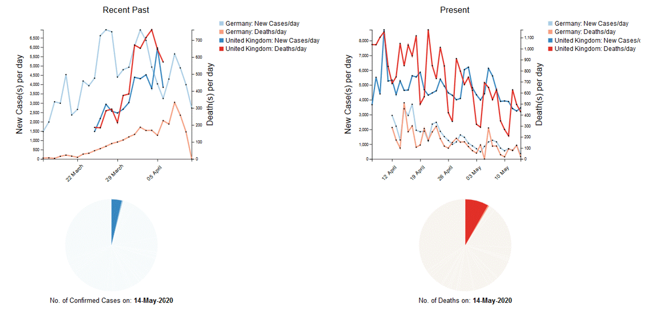
Figure 6. Comparative
analyses at different phases
We undertook a comparative analysis of all countries and
states on 29th April and generated the following graphs. The following
graphs represent a comparison of average number of new cases per day across
different countries and Indian states in recent past and present. The green
line and labels represent present while the red line and orange labels
represent recent past. The Y-axis represent number of new cases per day.
The graphs should be magnified and read in clockwise direction from top. For example, the average number of new cases per day are now similar in Indonesia and Romania and similar to recent past (approximately till second week of April) of Portugal and UAE. The average number of new cases per day is increasing in clockwise direction and it may be seen that the names of UAE and Iran first appears in red and then in green indicating an increasing trend.
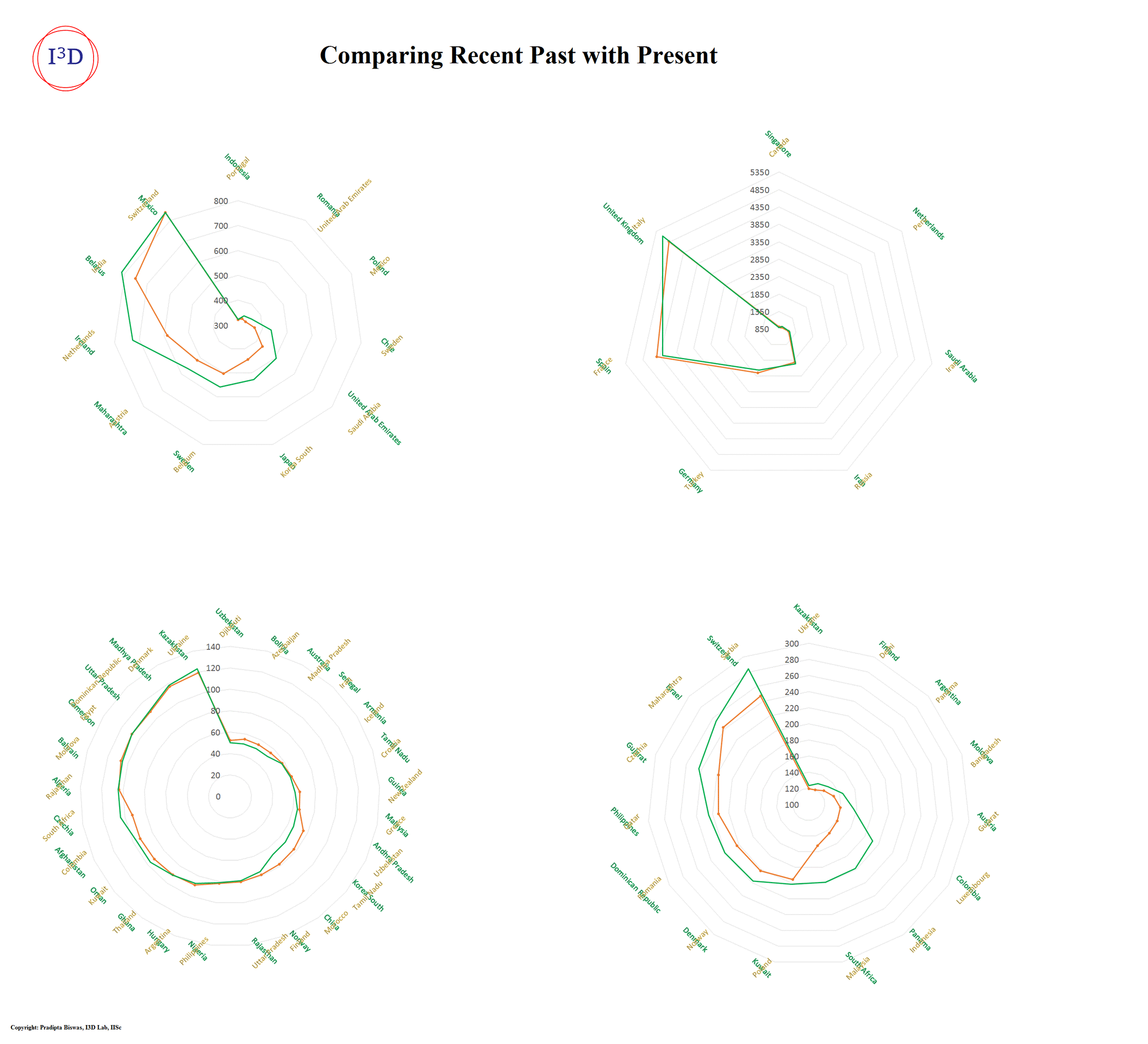
a. Comparison of different countries divided into 4 sets based on the number of cases per day
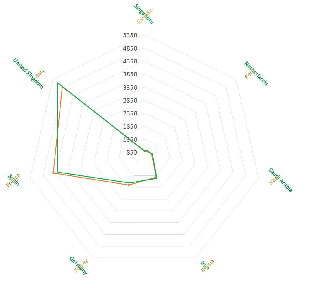
b. Magnification of one graph of figure 5a, comparing countries where number of new cases per day is greater than 850
Figure 7. Radar charts comparing rate of spread
Interaction with
Alternative Modality
In order to make the interaction with our dashboard convenient
and inclusive, we integrated Automatic Speech Recognition (ASR) and
Text-to-Speech (TTS) features into our web application. We used webspeech API [7] to implement these features. We included
navigation features like scroll up and scroll down along with the focus on
selecting various countries through voice commands. Once we obtain the access
to user's microphone, we classify the voice commands into three categories: a
country name or a navigation command or an unrecognizable text.
We have set the ASR recognition confidence threshold as 70%
and any predicted text with a lower confidence score would be rejected. On
recognizing a country's name, we render the information on COVID-19 cases
related to that country and use TTS engine to read out the necessary information.
This includes the total number of infections, number of recovered cases and
number of deaths. This also includes the information on new cases per day and
new deaths per day across all 3 phases detected by our knee detection
algorithm. On recognizing a navigation voice command, we simulate scroll events
on our web application. On recognizing a command that is unrecognized, we use Levenshtein distance to suggest a country name, based on
the difference between our dictionary and predicted text. The string in our
dictionary with least Levenshtein distance against
the predicted text would be suggested to the user. A video demonstration can be
found at https://youtu.be/lyvwK9enFtw
Conclusions
This paper summarizes existing visualization techniques used
to visually represent spread of COVID 19 pandemic across different countries
and presents a new interactive web-based system that automatically divides the
duration of spread into three phases. A set of use cases demonstrates the
utility of the new system in terms of comparing rate spread across different
countries and different times. The system can also indicate rate and trend of
spread over time and by comparing with past examples, the system can also be
used to predict future rate of spread. The system is also integrated to
automatic speech recognition and text to speech features to disseminate
information to people with different range of abilities.
References
1) Mapping the Worldwide Spread of the Coronavirus. The Washington Post, WP Company, 24 Apr. 2020, www.washingtonpost.com/graphics/2020/world/mapping-spread-new-coronavirus/.
2) Burn-Murdoch, John, et al. Coronavirus Tracked: the Latest Figures as the Pandemic Spreads: Free to Read. Financial Times, Financial Times, 25 Apr. 2020, www.ft.com/coronavirus-latest.
3) New Zealand flattening the curve, 27/04/2020, https://www.dailymail.co.uk/news/article-8259269/Australia-outperforming-New-Zealand-controlling-coronavirus-curve-without-stage-four-lockdown.html
4) Coronavirus Cases: Worldometer, www.worldometers.info/coronavirus/
5) 91-DIVOC. Flip the Script on COVID-19, 91-divoc.com/pages/covid-visualization/.
6) DAVID, Rémy. What's Wrong with COVID-19 Data Visualizations, and How to Fix It. Medium, Towards Data Science, 5 Apr. 2020, towardsdatascience.com/whats-wrong-with-covid-19-data-visualizations-and-how-to-fix-it-3cdc9adc774d.
7) Webspeech API, https://developer.mozilla.org/en-US/docs/Web/API/Web_Speech_API
8) World Health Organization, World Health Organization, covid19.who.int/.
9) Mamoon, Navid, and Gabriel Rasskin. COVID-19 Visualizer. Visualizer, www.covidvisualizer.com/
10) Bing, Microsoft, bing.com/covid/local/india.
11) COVID-19 - Analysis, Visualization & Comparisons. Kaggle, Kaggle, 7 Apr. 2020, www.kaggle.com/imdevskp/covid-19-analysis-visualization-comparisons.
12) Tableau Public, public.tableau.com/profile/oregon.health.authority.covid.19#!/vizhome/ OregonHealthAuthorityCOVID-19DataDashboard/COVID-19EPIConfirmed.
13) COVID-19: Free Live Mobile-Friendly Visualizations for Use on Any Website. Flourish, flourish.studio/covid/.
14) INTERACTIVE COVID-19 DATA BY LOCATION. Footer Image, pandemic.internationalsos.com/2019-ncov/covid-19-data-visualisation.
15) 2020 Coronavirus Pandemic in India. Wikipedia, Wikimedia Foundation, 28 Apr. 2020, en.wikipedia.org/wiki/2020_coronavirus_pandemic_in_India.
16) Satopaa, V., Albrecht, J., Irwin, D., & Raghavan, B. (2011). Finding a ‘kneedle’in a haystack: Detecting knee points in system behavior. 166–171. In 31-st International Conference on Distributed Computing Systems.
17) Saluja KPS, Jeevithashree Dv, Arjun S. and Biswas P., Analyzing Eye Gaze Movement of Users with Different Reading Abilities due to Learning Disability, 3rd International Conference on Graphics and Signal Processing (ICGSP 2019)