Examples of Covid-19 Data Visualization

Covid 19 Banner
covidVisualizer covidVisualizer
  • An interactive digital world globe visualization which displays total cases, active cases, total deaths and recovered cases
  • Clicking on country map will display data parameters on rectangular box
secondderivative
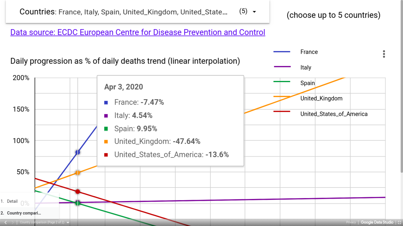
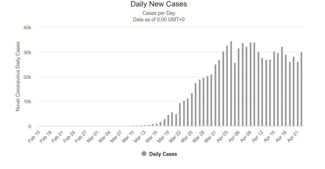
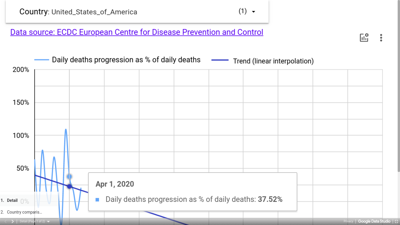
  • An interactive line chart visualization for showing progression rate of daily deaths and cases.
  • If progression rate is positive, number of deaths/cases is growing, if it is negative, then number of deaths/cases is shrinking.
  • The chart also displays trends. Trends tells about the growth of progression rate. If trend is going up, the growth is accelerating, if it is going down then the growth is slowing. When trend crosses 0, the outbreak is at its peak.
  • Two line charts are used in this visualization. Light blue line shows daily death or cases progression rate. Dark blue line shows trends.
countryComparison
  • Interactive line charts for displaying the growth rate of daily number of cases and deaths
  • Multiple line charts are used for comparing the growth rate across different countries
washintonPost
  • Interactive world map visualization for showing total number of cases and deaths.
  • A bubble is plotted at each country on the world map. The size of the bubble depends on the severity of attack at the country. More the number of cases and deaths, more is the size of bubble.
  • Clicking on bubble will display the two parameters.
  • This visualization can also be used to compare parameters between different countries.
washintonPost
  • Series of bar charts are used for comparing parameters like new cases and deaths between different countries over a period.
  • Single bar chart is used to represent one country.
  • Each bar in the chart depicts new cases on the
    y-axis and dates on the x-axis.
FinancialTimes_ComparisonGraph
  • This interactive chart is taken from Financial Times. It compares two covid-19 data parameters, that is deaths and cases across different countries.
  • A collection of line charts is used to represent parameters for each country.
  • Compares both new and cumulative parameters. In addition to raw numbers, it also shows parameters in per million unit.
  • The vertical axis of the chart is shown using both logarithmic and linear scales.
newzealandCountry
  • Another static visualization where bar and line graphs are combined.
  • Bar graph represents information about the number of new cases on the y-axis.
  • Line graph depicts the change of percentage of daily deaths due to virus on the y-axis.
  • Dates are represented on the x-axis
worldometers covidVisualizer
  • These two pictures are taken from Worldometers. Two different visualization techniques are used for showing new cases and cumulative cases
  • Bar chart depicts the number of daily new cases on the y-axis and dates on the x-axis.
  • Line chart represents total number of cases on the y-axis and dates on the x-axis
wikipedia_India
  • This visualization is captured from Wikipedia. Stacked bar chart is used to show three parameters for covid-19 data, which are total deaths, total cases and total recovered cases.
  • All parameters are shown on the x-axis and dates are exhibited on the y-axis
  • This is an interactive visualization with the option of selecting months or days for displaying the parameters.
Infodemics Observatory
  • This interactive visualization tool is taken from Infodemics. It represents details about excessive amount of information due to covid-19 outbreak.
  • This tool illustrates the digital response on online social media due to the virus.
  • Uses heat maps on main window to visualize four parameters. The parameters are total cases, risk index, percentage of unreliable facts and sentiments.
  • The window on the right side shows three separate bar charts.
  • First bar chart depicts time course of the average number of tweets per day. Furthermore, it also depicts time course of the major stock market index closing price percentage change.
  • Second bar chart shows analysis of URLs present in tweets to determine if they are trustworthy. It also displays analysis of potential number of users exposed to trustworthy URLs in the tweets.
  • The last bar chart shows sentiment, emotional and psychological analysis of the tweets per day.
Data Wrapper
  • Interactive stacked area charts are used to represent new cases and deaths per day. The two parameters are shown in separate charts.
  • These charts can also be used for comparing parameters across countries. Data of each country is represented by single area graph, stacked one above the other.
  • The chart shows seven day rolling average of the parameter. Parameters are depicted on the y-axis and days are shown on the x-axis.
  • Hovering on the graph will highlight the selected country and display the exact number of the parameter.