

Click on the image below to launch application.
 Tested only with Chrome Browser (33+)
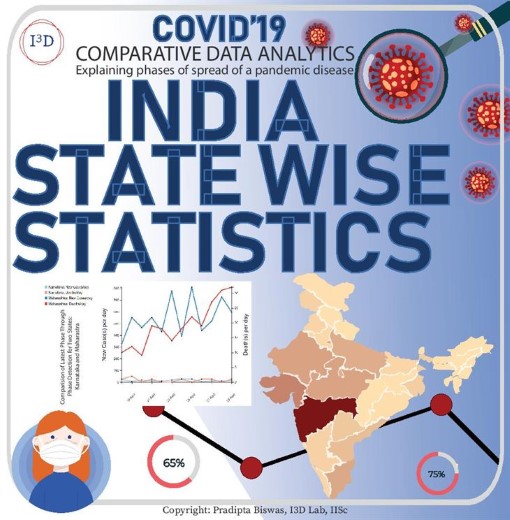
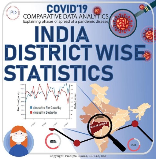
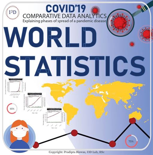
At present, the spread of COVID-19 is shown to have an exponential trend in most countries. An exponential curve is difficult for both comparison and prediction as it has a vertical asymptotic trend to infinity. We have developed this website that automatically divides the duration of spread of the disease based on rate of increase in new cases, and shows a set of three graphs which are easier to interpret and extrapolate than a single exponential graph. The shape of the graphs (like linear, parabolic or exponential) can be compared at different stages and countries with respect to the average number of new cases and deaths.
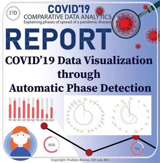
Pradipta Biswas, Kamalpreet Singh Saluja, Somnath Arjun, Lrd Murthy, Gowdham Prabhakar, Vinay Krishna Sharma, and Jeevitha Shree Dv. 2020. COVID-19 Data Visualization through Automatic Phase Detection. Digit. Gov.: Res. Pract. 1, 4, Article 25 (August 2020), 8 pages. DOI:https://doi.org/10.1145/3411756
Coronavirus "contact tracing" apps may be all the rage now, but a team of design scientists at the Indian Institute of Science (IISc), have developed a new Covid-19 analysis application geared...
Scientists based in a Gates Cambridge Scholar's lab at the Indian Institute of Science have developed a new app which shows the rate of spread of COVI...